Projects / Exercises / Readings / Grading Criteria
On Line Journal in Blog Format [on going]
Students will build and maintain an online journal of documentation of the evolution of their process throughout the course. Each project and the series of exercises / studies produced will be documented on a personal blog, or other type of digital publisher. This personal journal is worth 100 pts. towards your final grade. This on line journal will be reviewed at various points throughout the semester to ensure adequate entries and caliber of content. This will also be an appropriate place for your annotated bibliography to be published.
Courtney Nazak
Matthias Kleven
Taylor Maruyama
Karin Hsu
Stevie Caldron
Carter Rudnick
Keira Rowland
Mia Aguillon
Elena Staats
Alex Crook
Shuaa Alharbi
Priscilla Lai
Giovanna Cappetta
Paige Glasser
Leland Long
[link to Typography Course Fall 2011 Blog]
Annotated Bibliography [on going]
Each Student will turn in an annotated bibliography of ten or more readings (books or design journals only) to represent their cumulative project research for the semester. Each annotation must begin with the title, author, and publisher of the chosen text, using the citation style featured in the Recommended Reading list, followed by a 150-word description of this text, including its merits or detriments as a personal research tool and the ways it informed your thinking, your design process, and/ or your work.
Exercise 01 / Billboard as Personal Advertisement
Design a billboard advertisement that will inform, persuade, promote, educate an audience. Tell an audience who you are with typographic form. Photograph a billboard in the city and alter it with your own typographic message. Photograph billboards in the city (3 - 5 minimum) and then select the best composition for optimal readability. Convert billboard photographs to black and white. Adjust for laser print output.
[Click here to download Project Briefs for Annotated Bibliography On line Journal, Exercise 01]
Project 01 /
Survey of the History of Typography
Working in groups of two, students will be responsible for researching an assigned period of time in the history of typography. Groups will be responsible for preparing a short presentation that is inclusive of their research. Presentations will be designed to illustrate the significance of the specified period in typographic history. Presentations will demonstrate an understanding of the ways in which typography, as a discipline, has been influenced by the economic, social and / or political conditions of a place and time.
The Mechanics of Page Layout + Grid-Based Design will also be covered. Students will gain knowledge of the following design fundamentals.
type identification / classification
letterform anatomy
typographic syntax
typographic resonance
typographic heirarchy
typographic space
[Click here to download Project Brief for Project 01]
[Click here to see student's E-Publication: "Survey of the History of Typography"]
Exercise 02 / Type as Shape + Typographic Joinery
Students will learn about the basic anatomy of letterforms while looking at type as shape.
Students will the expressive qualities of different type families, discover visual solutions in which two characters can be combined to form a new symbol or monogram. In addition, students will develop a sensitivity for shape, proportion, weight, balance and beauty in letterforms.
[Click here to download Project Brief for Exercise 02]
[Click here to download reading "Letter Fountain" [on printing types]
Project 02 / The Mechanics of Page Layout
Create three different layouts with five different pages, all using the same underlying grid. You may choose one the following typefaces for your studies:
Helvetica / Baskerville / Bembo / Bodoni
Caslon / Century Schoolbook / Clarendon / Didot
Franklin Cothic / Univers / Futura / Garamond
Gill Sans / Meta
3 layouts,10” X 10” each, trimmed to size.
layout 01 - Using one typeface, 9 pt. size only throughout the layouts
type along the X-Axis only
layout 02 - Using one typeface introduce 4-5 other point sizes
type along the X-Axis and Y-Axis
layout 03 - Use one typeface and use variations in point size and style within ONE type family
type along the X-Axis, Y-Axis and Z-Axis

Study Topics
typographic contrasts structure and alignment
groups and space repetition [unity/variety]
value and shades of gray color to emphasize / organize
overlapping and layered text shape as a compositional element
dramatic scale contrast use of page edge as a design element
[Click here to download Project Brief for Project 02]
Readings:
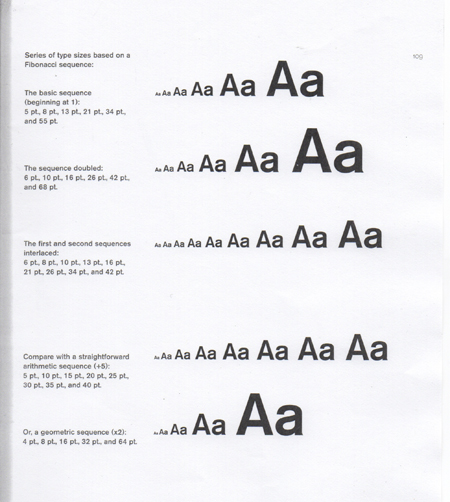
[Click here to download "A Type Primer" / The Fibonacci Sequence and Creating Heirarchy]
Exercise 03 / Type as Identity
Students will design a stationary package for themselves. Select one typeface and use variations of it to design a business card, letterhead and envelope for personal use.
Letterhead = 8 1/2" X 11" paper size
Envelopes = Standard #10, 4.125" x 9.5"
Business Card =
3.5" × 2", standard size - horizontal
[Business Card Template]
[Click here to download Project Brief for Exercise 03]
Project 03 / Typography as Service
Students will design a typographic identity and establish typographic standards for an organization. Research + Design Presentations
Client
BURTON MORRIS, LLC
Nursing Communication
Burton Morris is a research-based/competent company motivated to meet the communication needs of nurses. They are invested in providing the nursing community with available research and communication practices/resources to enhance nurse-patient interaction.
[Click here to download Project Brief for Project 03]
Mia Aguillon / Typographic Standards
Manual [download .pdf]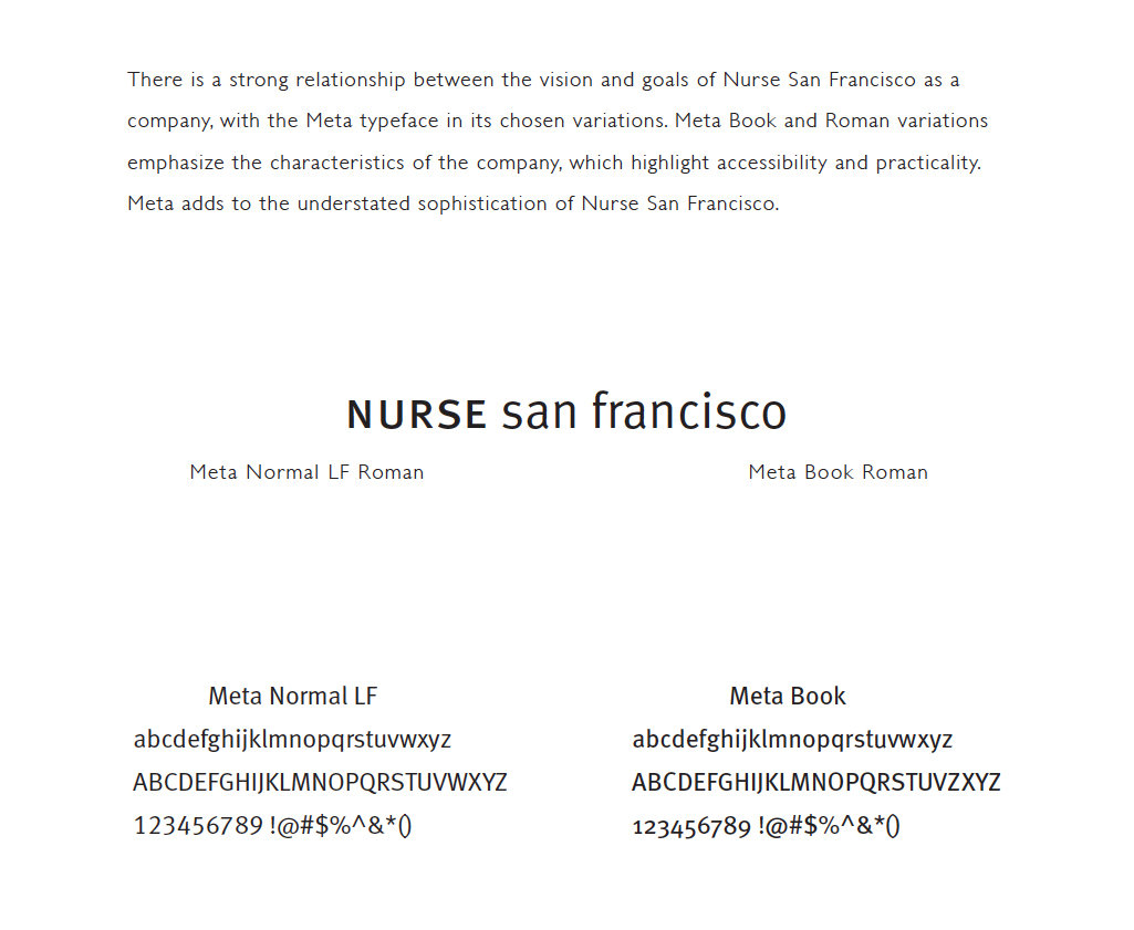
Exercise 04 / Typographic Space / Grid!
Objectives
Research typographic space
Explore grid design
Develop a grid system for your web page for Project 03
Find a web site that you think is good design and layout. Select a web page that you are interested in understanding how it is constructed.
[Click here to download Project Brief for Exercise 04]